Decathlon - App redesign
Overview
About Decathlon
Decathlon is a well-known sports company, and I've heard concerns about the app experience from my friends, so I decided to give it a shot. There are numerous fundamental yet significant type issues in app design that contribute to an unsatisfactory overall experience.
What I did
UX/UI Design
Research
Qualitative Research
-
Because the app does not have separate sections for men, women, and children, it is difficult to go to the desired part.
-
The app lacks a Wishlist feature for saving liked items.
-
The app does not indicate whether a product is in stock or not
-
The app doesn't have a proper filter option for finding the desired item.
-
Also, the UI, such as card design, sections are not easily distinguishable at a glance, which may be confusing to some users.
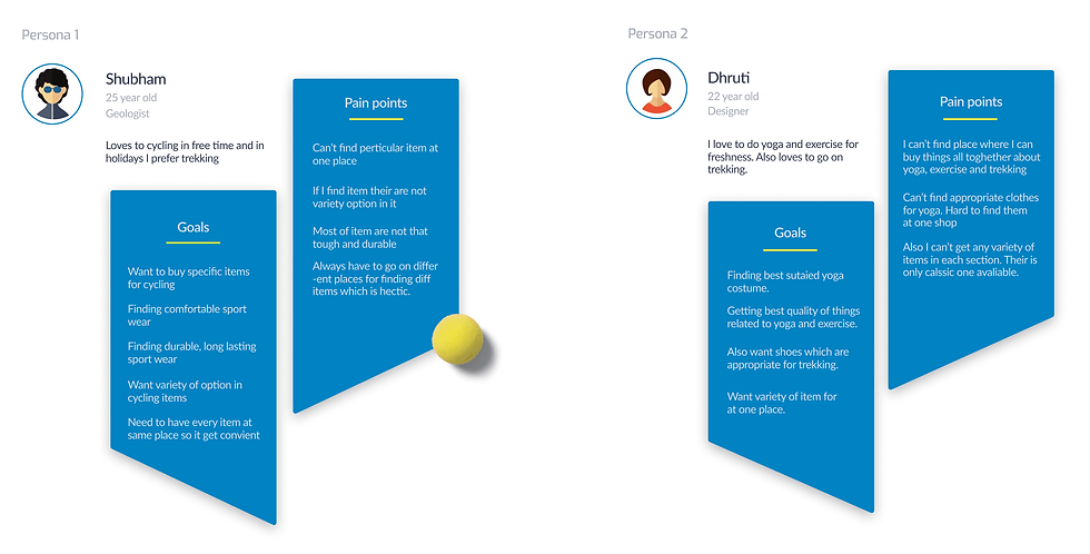
Persona
UX Audits


Information Architecture
Organizing information structure.
we organize and structure content to enhance user navigation and understanding. We create clear hierarchies and relationships between information elements. This process ensures intuitive access and improves overall user experience.

Userflow
User interaction blueprint
This diagram shows how user can go through the application to obtain their their goal.

Brainstorming
.png)


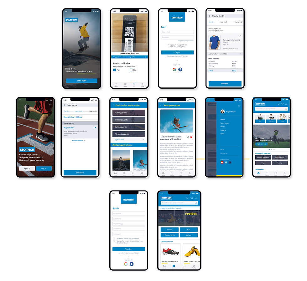
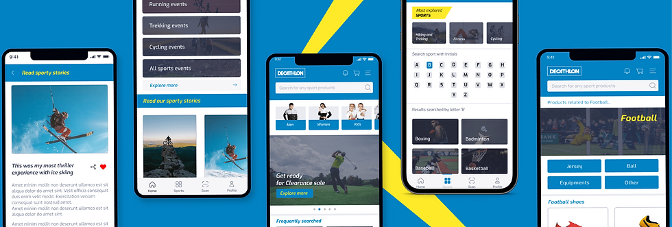
Wireframes
Interactive design skeletons

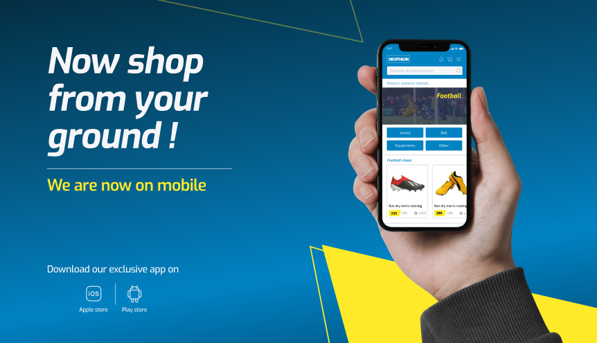
UI Design
Interface visual crafting